Budget-conscious creators should buy the most accurate monitor they can realistically use, then improve consistency with calibration, controlled lighting, and a repeatable review workflow. The goal is not perfection, but fewer surprises when images leave your screen.
TL;DR
- Prioritize panel quality, color coverage, resolution, brightness control, and ergonomic adjustment over flashy extras.
- Calibrate or profile the display regularly if color matters to your work.
- Use reference checks, consistent room light, and export tests before blaming the monitor.
Know What Accuracy Means for Your Work
A wedding photographer, YouTube editor, print designer, streamer, and short-film colorist do not need the same monitor. Start with the final destination. If your work is mainly web, social, and basic video, strong sRGB coverage and reliable brightness may matter more than a wide-gamut premium panel. If you print photographs or design for clients, wider gamut support, hardware calibration options, and predictable profiles become more important.
The International Color Consortium promotes profile-based color management, which is the foundation for making devices describe color in a consistent way. A profile does not turn a weak display into a reference monitor, but it helps your system understand how that specific display behaves. The most useful budget mindset is to buy a monitor with decent native performance and then reduce variables around it.
Features Worth Paying For
For creators on a budget, an IPS or similar wide-viewing panel is usually safer than a cheap panel with obvious color shift. Resolution should match your work and desk size: 24-inch 1080p can be usable, 27-inch 1440p is a strong editing sweet spot, and 4K is helpful for detailed photo work if your computer can drive it comfortably. Look for factory calibration claims, a usable stand, matte finish, enough ports, and brightness that can be adjusted lower for evening work.
Avoid paying mainly for gaming refresh rates if your main job is color-critical editing. High refresh can be pleasant, but it will not fix poor uniformity, weak contrast, or bad color controls. The same discipline that improves typography layouts for non-designers applies here: choose features that help the work before choosing features that look impressive on a spec sheet.
| Creator need | Monitor priority | Budget compromise to avoid |
|---|---|---|
| Photo editing for web | Good sRGB coverage, IPS panel, stable brightness | Very bright uncalibrated display used in a dark room |
| Print-oriented work | Wide gamut, profiling support, soft-proofing workflow | Assuming a generic profile will match every lab or printer |
| Video editing | Consistent contrast, 4K or 1440p workspace, clean motion | Buying refresh rate instead of tonal consistency |
| Mixed creator work | Ergonomic stand, reliable ports, easy color presets | Glossy screen in uncontrolled light |
Calibration Is a Habit, Not a One-Time Fix
Monitor calibration adjusts display behavior, while profiling describes that behavior to your operating system and software. Many creators use the word calibration for the whole process, but the practical point is simple: measure the display, set useful targets, and repeat on a schedule. EIZO's explanation of monitor calibration is helpful because it notes that brightness and white point can drift as monitors age and operate over time.
A hardware colorimeter is the best upgrade when color accuracy affects paid work. If that is not possible yet, use built-in operating-system calibration tools, turn off aggressive dynamic contrast modes, work in consistent light, and compare exports on multiple devices. Software-only calibration is not as reliable as measurement, but it can still prevent extreme settings from misleading you.
Room Light Can Undermine a Good Screen
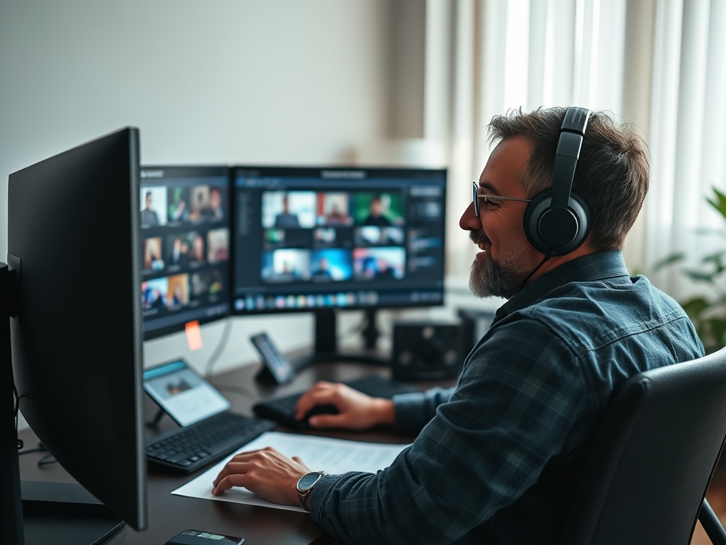
A monitor that looks accurate at noon may look too warm at night if the room changes from daylight to a yellow lamp. A bright screen in a dark room can make images look richer than they are. A window behind the display can reduce perceived contrast. Budget creators often get a bigger improvement by controlling the environment than by replacing a monitor too early.
Keep the monitor away from direct glare, use a neutral wall or backdrop when possible, and set a comfortable brightness you can repeat. If you edit at different times of day, create a preferred review window for final color decisions. For video and photo shoots, that same preparation mindset pairs well with media-card, battery, and file-naming routines before a shoot when those production habits exist in your wider workflow.
A Budget Calibration Routine That Works
First, reset the display to a neutral preset, not a vivid retail mode. Second, set brightness for the room rather than leaving it at maximum. Third, choose the color space or picture mode that matches your work, often sRGB for web output. Fourth, run calibration or profiling if you have a device. Fifth, restart key apps so they read the profile correctly. Sixth, check a known reference image and a recent project before starting paid work.
Repeat the routine monthly for serious work, or at least before important print orders and client deliveries. Keep a small log of date, target settings, room notes, and profile name. If results suddenly change, the log helps you separate monitor drift from software updates, driver changes, or accidental setting resets.
When to Upgrade Instead of Adjust
Calibration cannot fix a monitor with severe uniformity problems, crushed shadows, unstable brightness, or viewing-angle color shifts. Upgrade when you spend more time fighting the screen than editing, when paid work demands predictable output, or when you cannot match basic reference images even after reasonable setup. Do not upgrade only because a new monitor promises a huge color number. Check reviews, return policy, warranty, and whether your computer supports the resolution and refresh combination.
Your next step is to define one target workflow: web photos, print photos, YouTube video, client design, or mixed creator work. Buy for that workflow, control the room, and create a repeatable review routine. Consistency is the real budget advantage because it makes every future edit easier to judge.
Use Reference Checks Before Delivery
Before sending final files, compare your image or video on at least one other device you know well. Do not chase every difference between screens, because consumer devices vary widely. Instead, look for major warning signs: skin tones that feel too red, shadows that crush into black, highlights that lose detail, or saturation that looks extreme everywhere except your editing monitor.
Keep a folder of reference images and completed projects that you trust. Open them before important edits so your eyes reset to a known baseline. This is especially helpful after long sessions, when fatigue can make a dim, warm, or oversaturated screen feel normal.
If you cannot buy a calibration device yet, schedule a rental or borrow one from a local photo club, school lab, or collaborator before important deliveries. One measured session can reveal whether your current display is close enough for the work you do or whether an upgrade should move higher on the budget list.